Case study · 02
BRKLYN.
Made recognisable.
Client
BRKLYN
Type of client
Hospitality venue + in-house chicken brand, Cheekies
Category
Brand content, photo, video
Brief
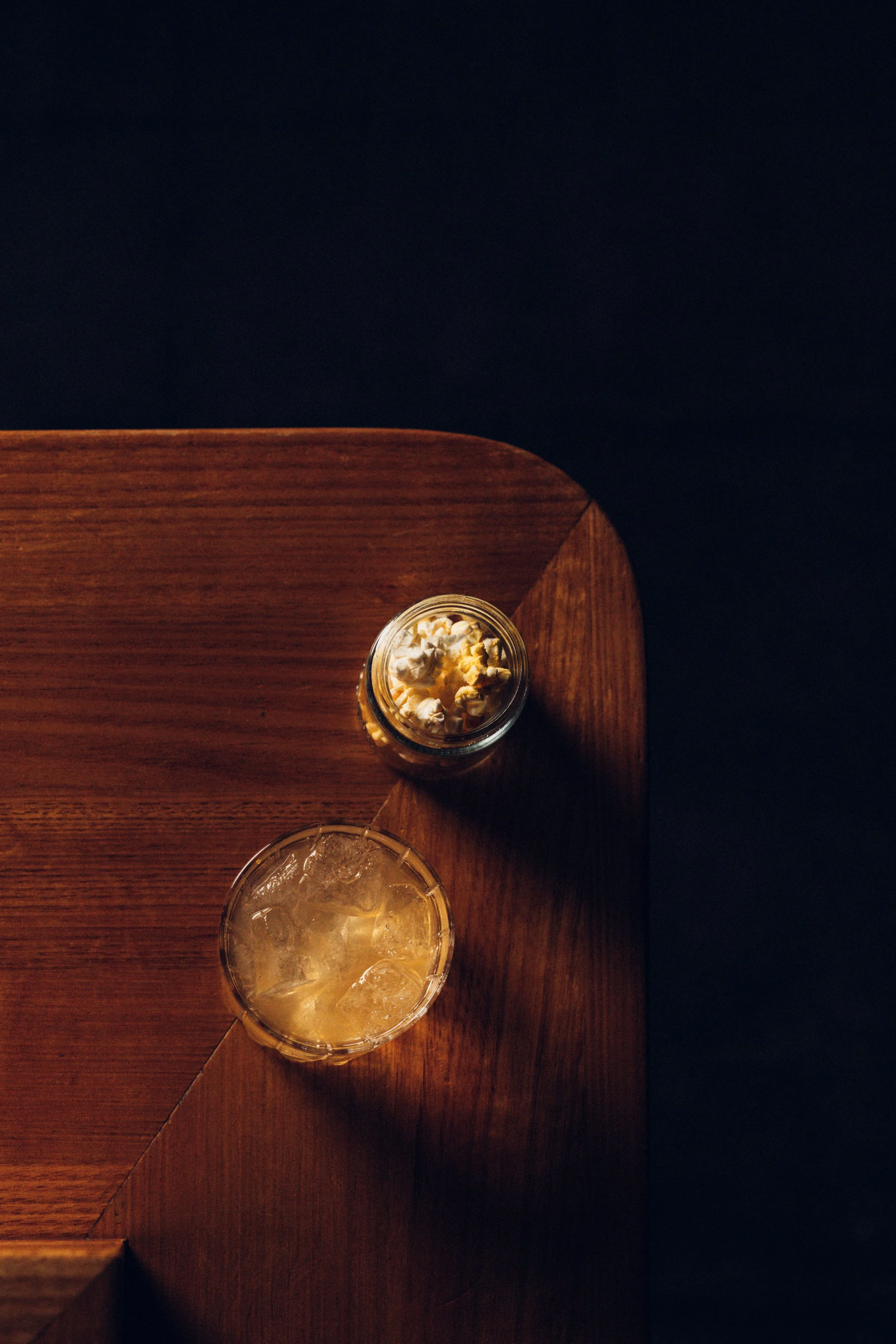
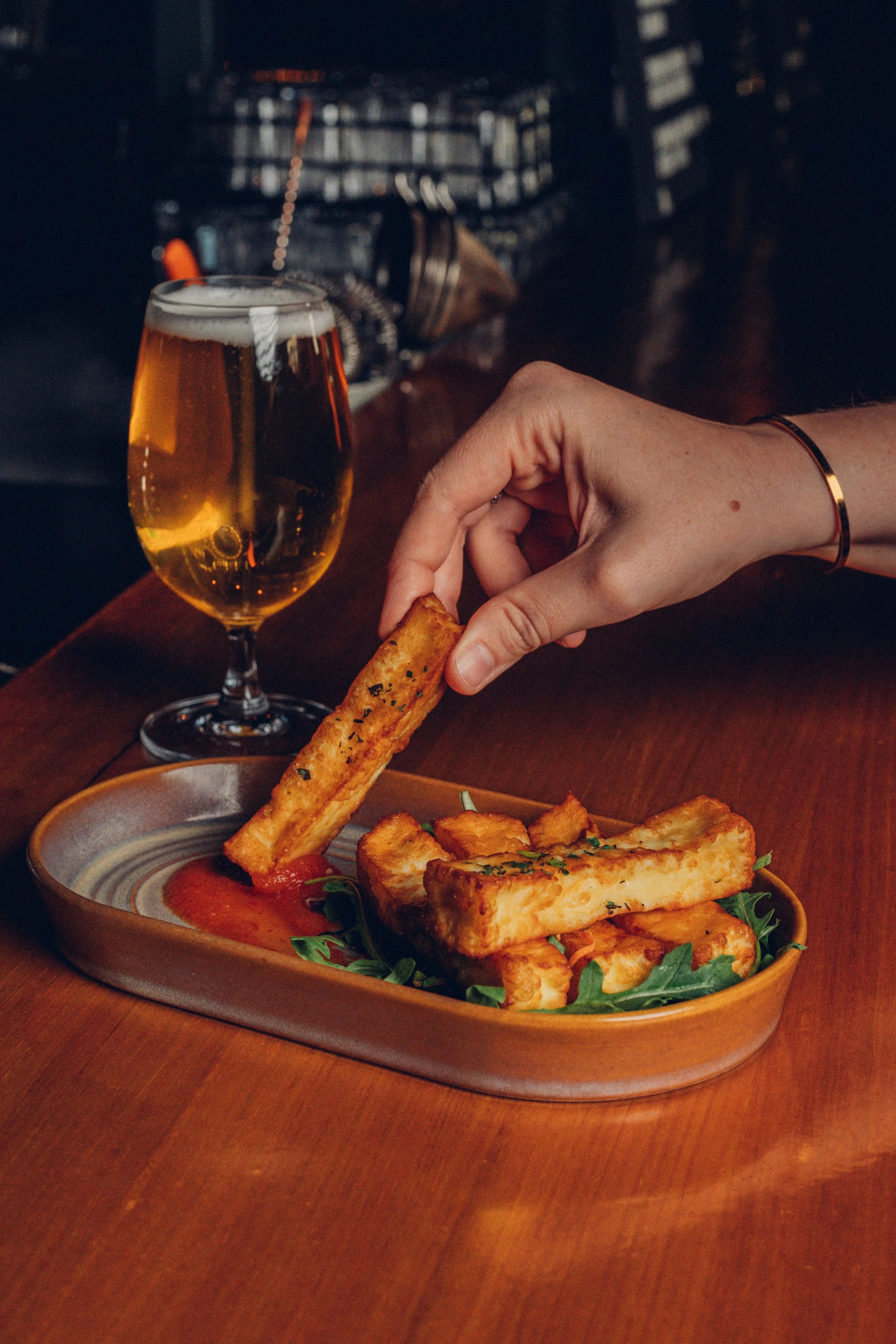
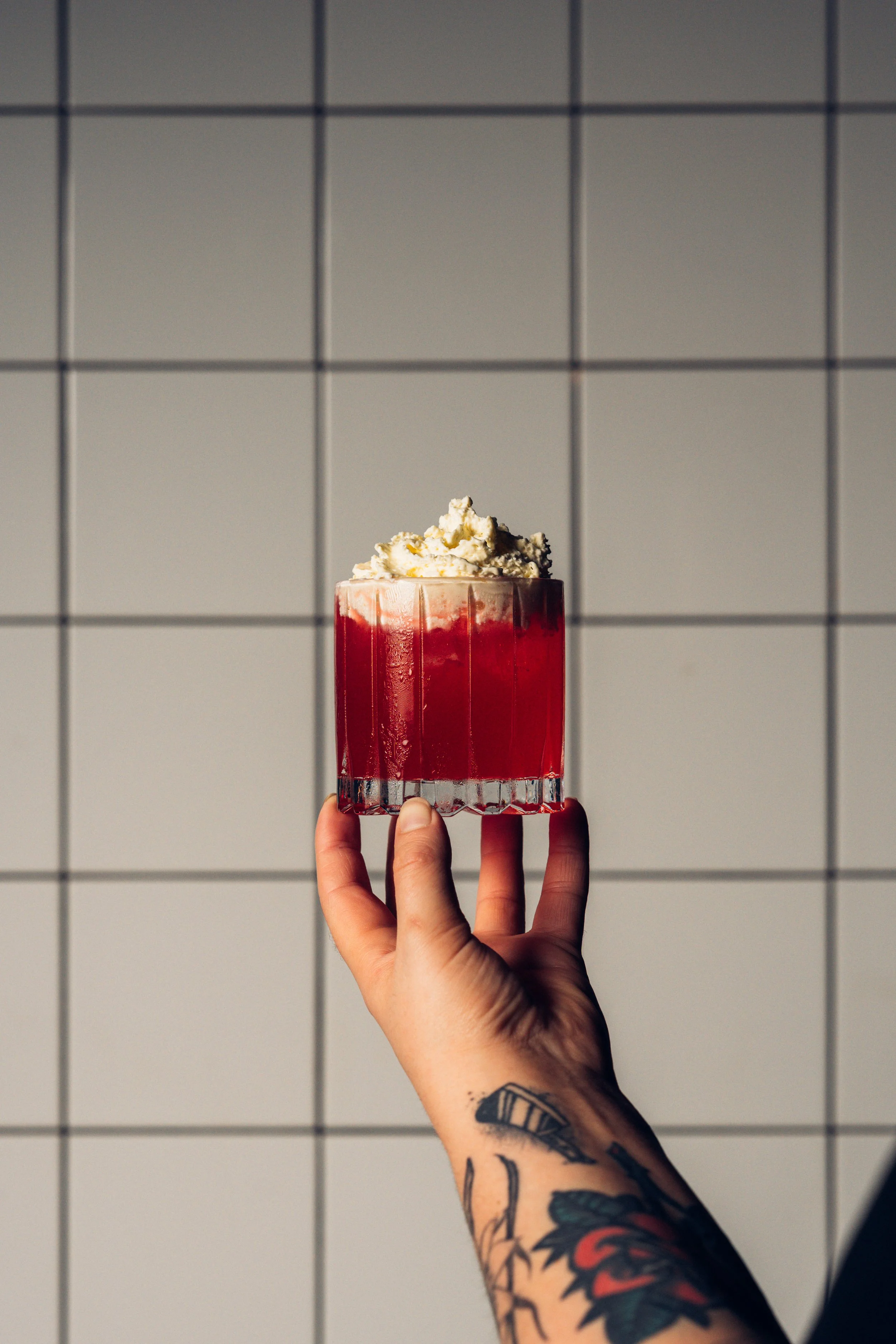
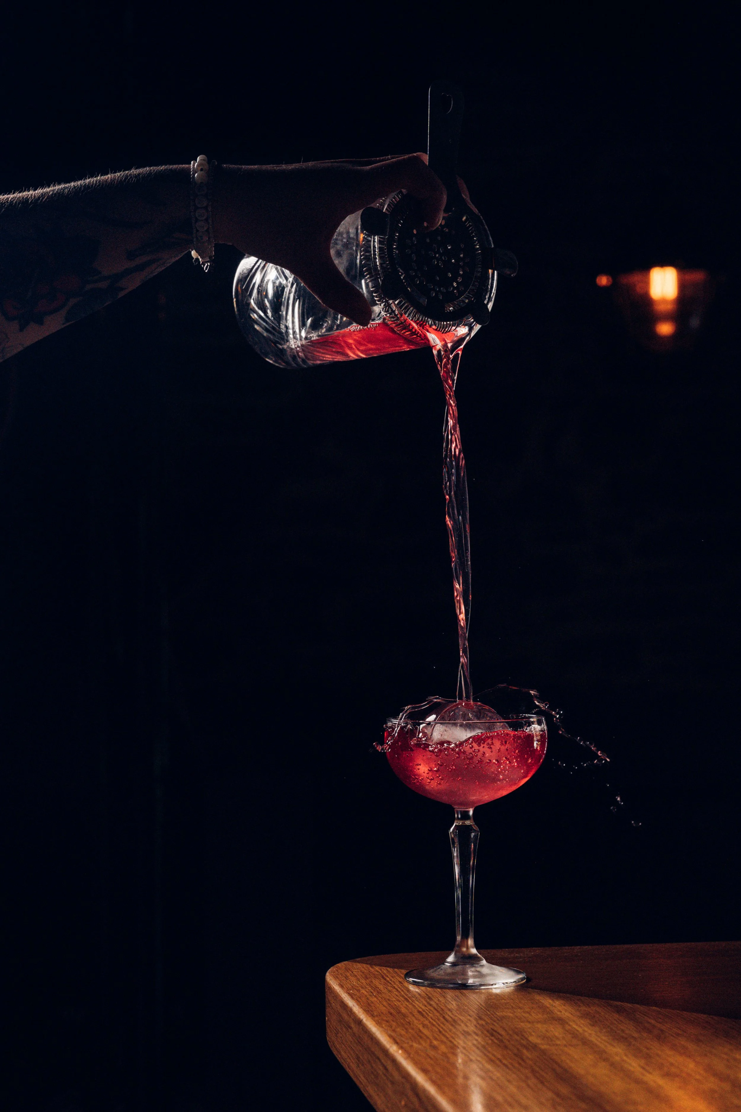
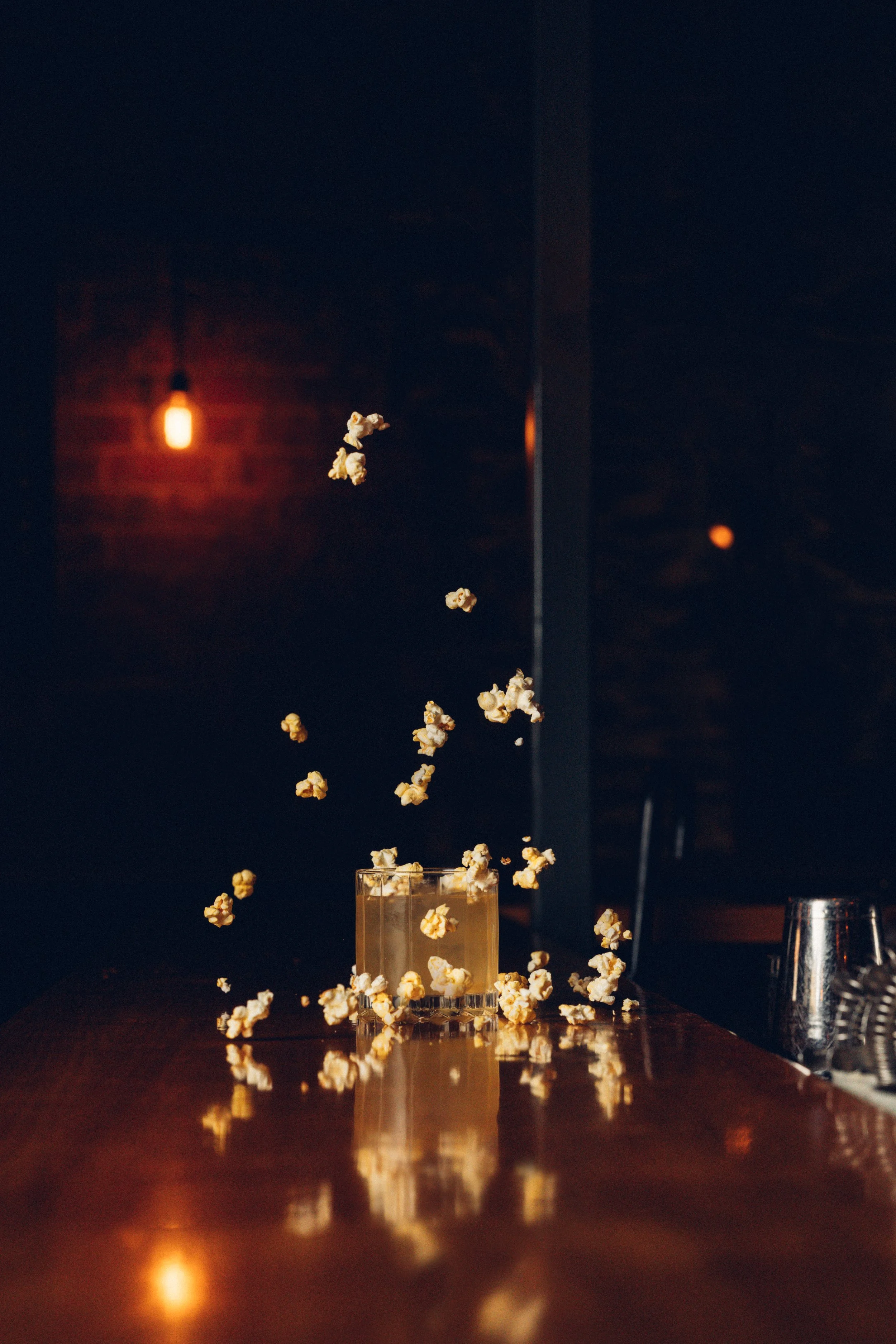
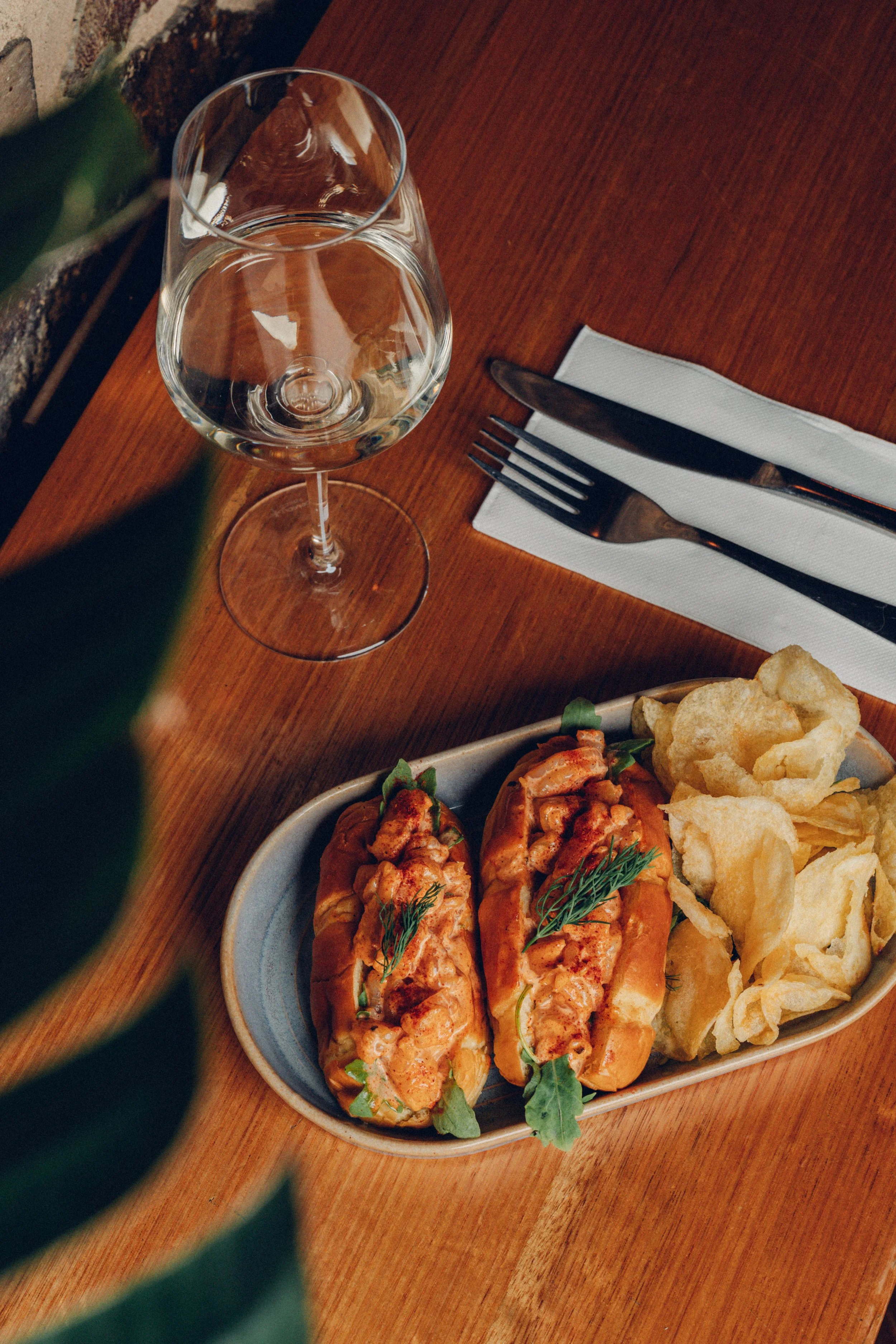
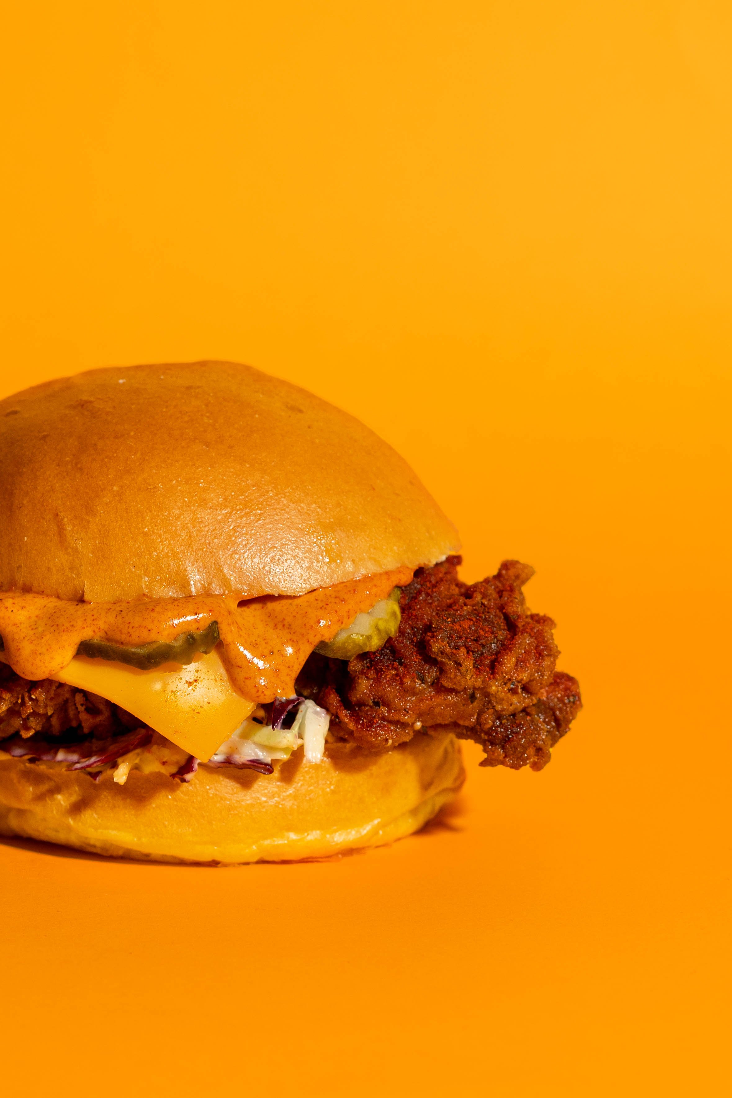
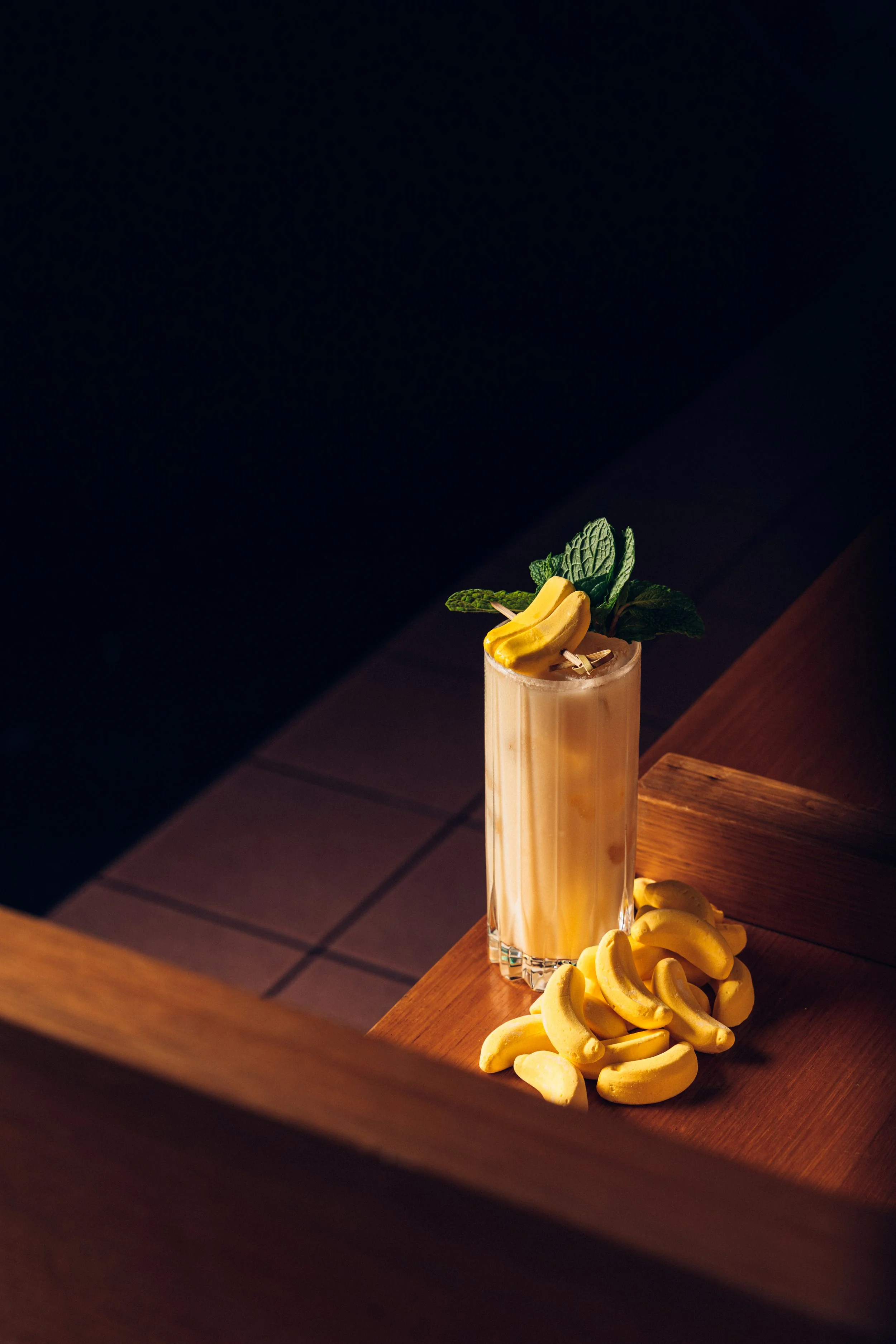
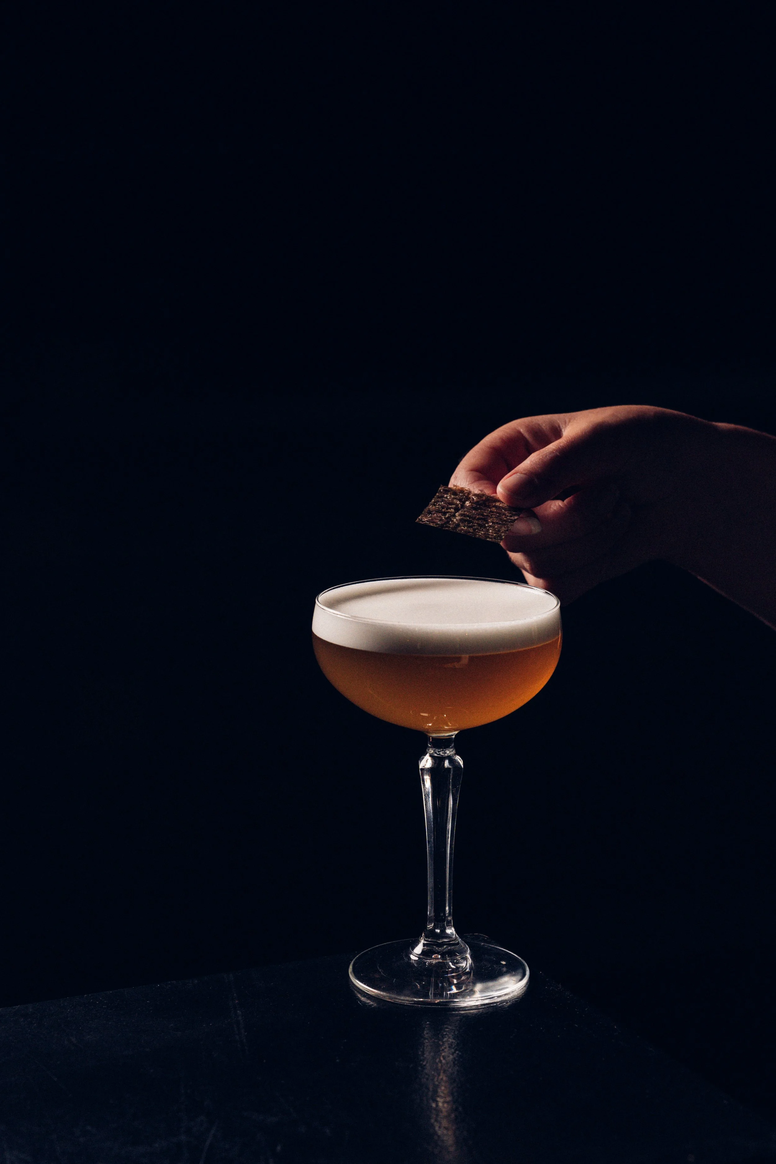
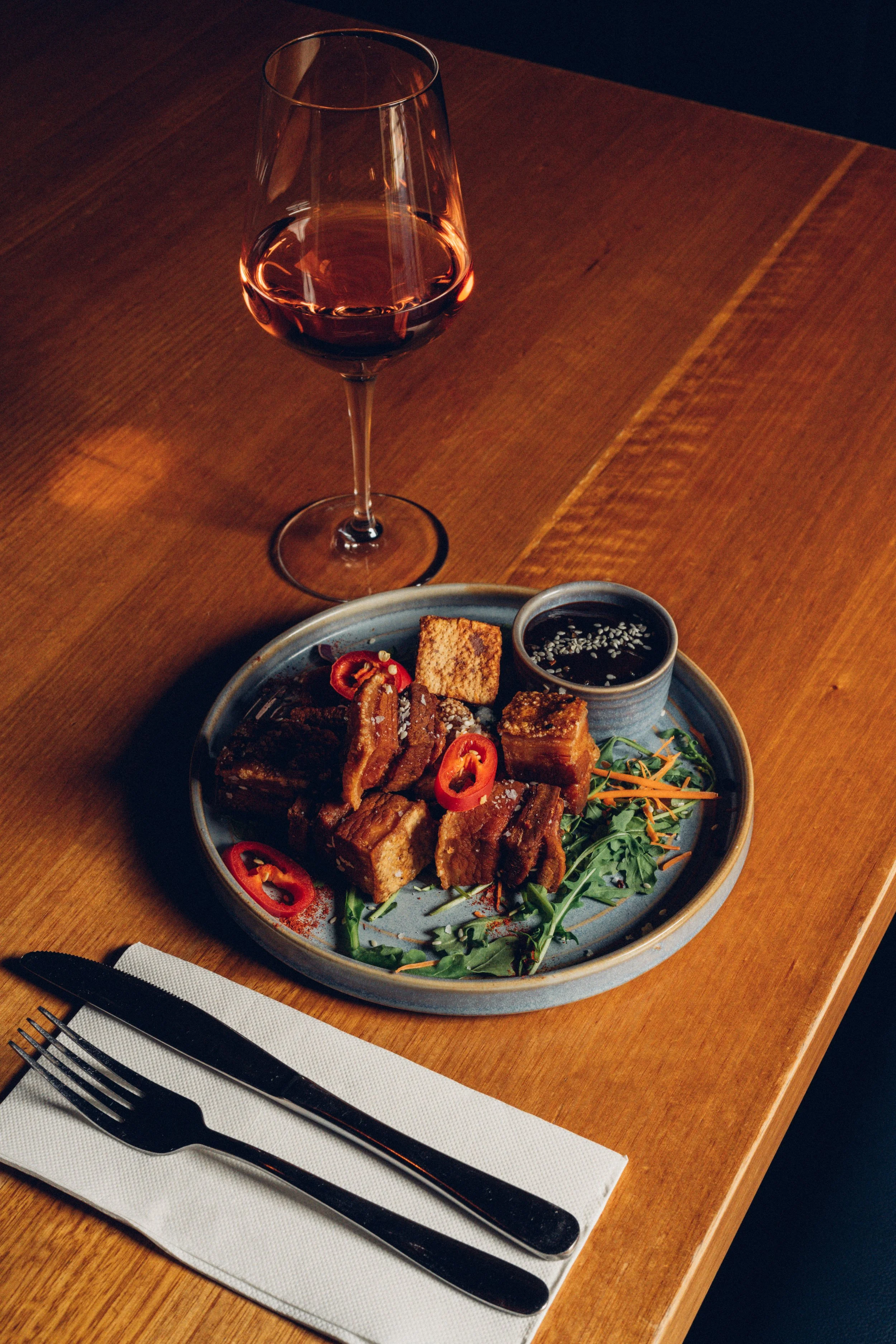
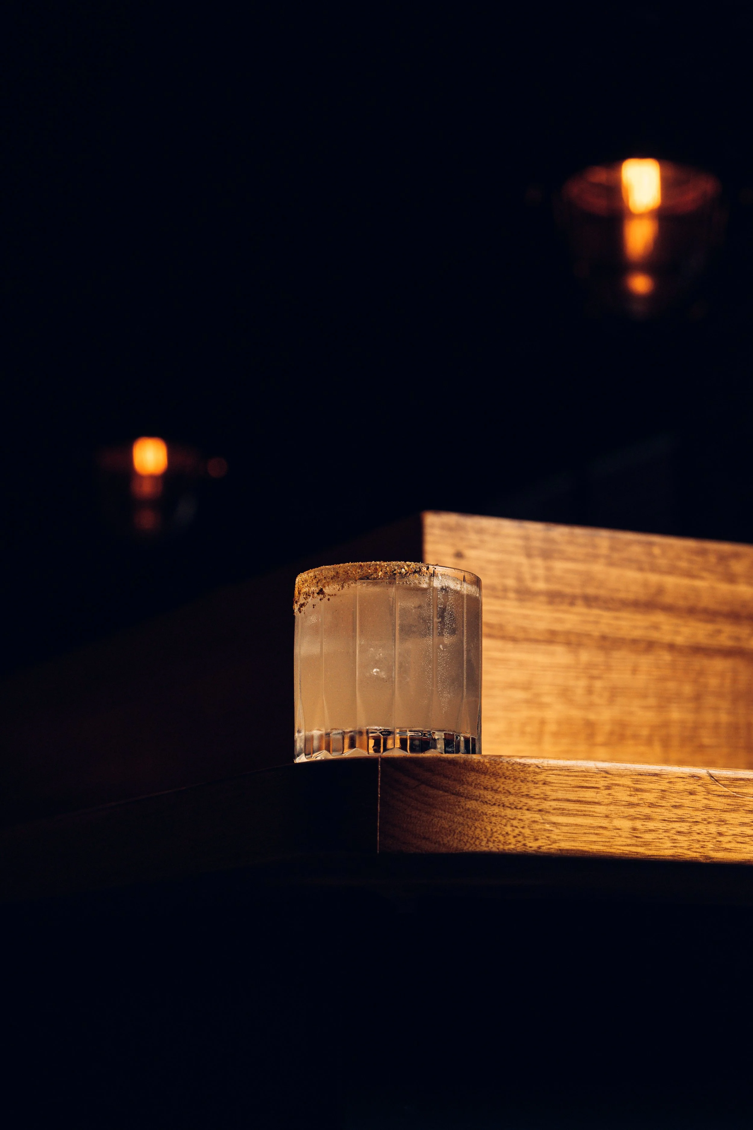
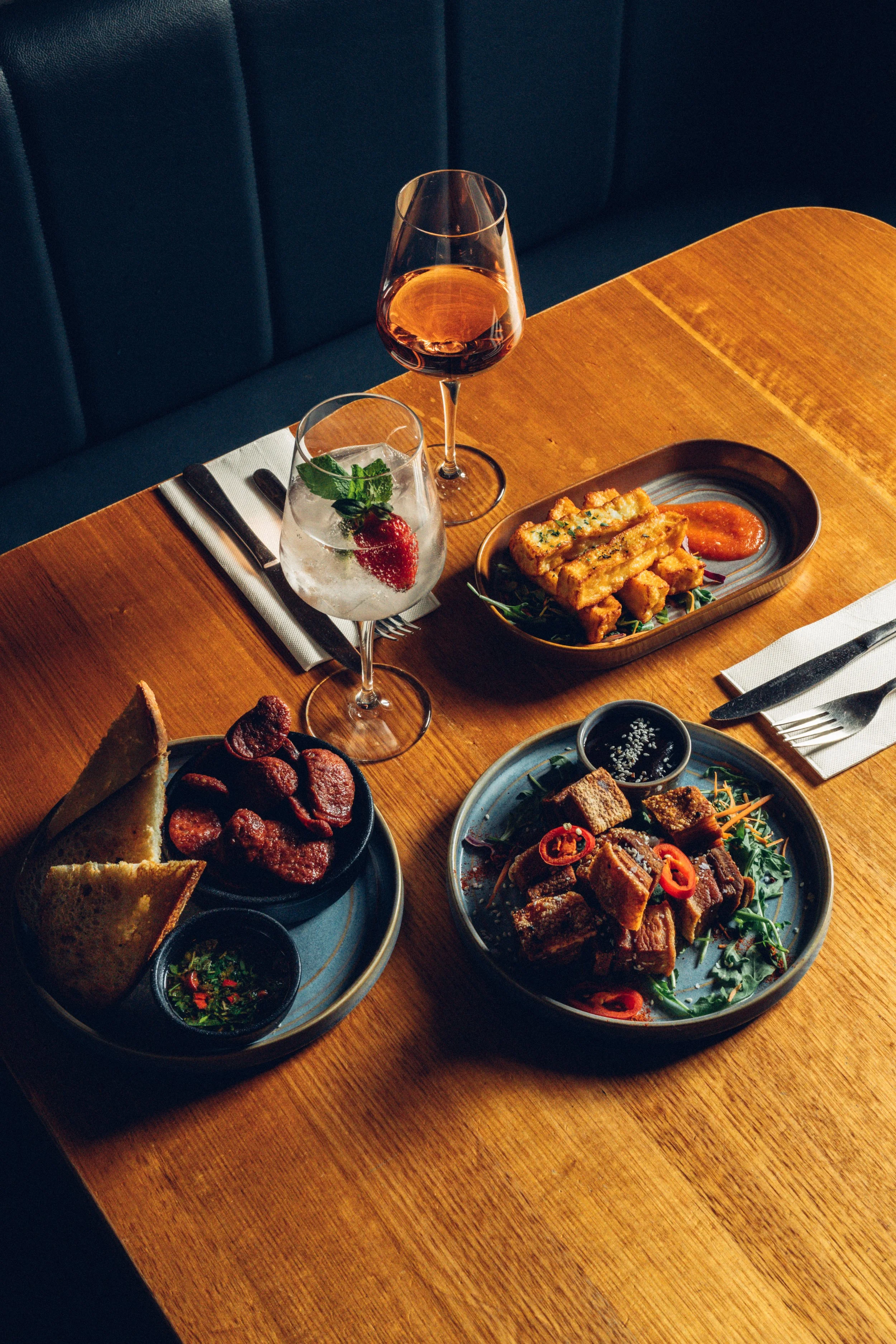
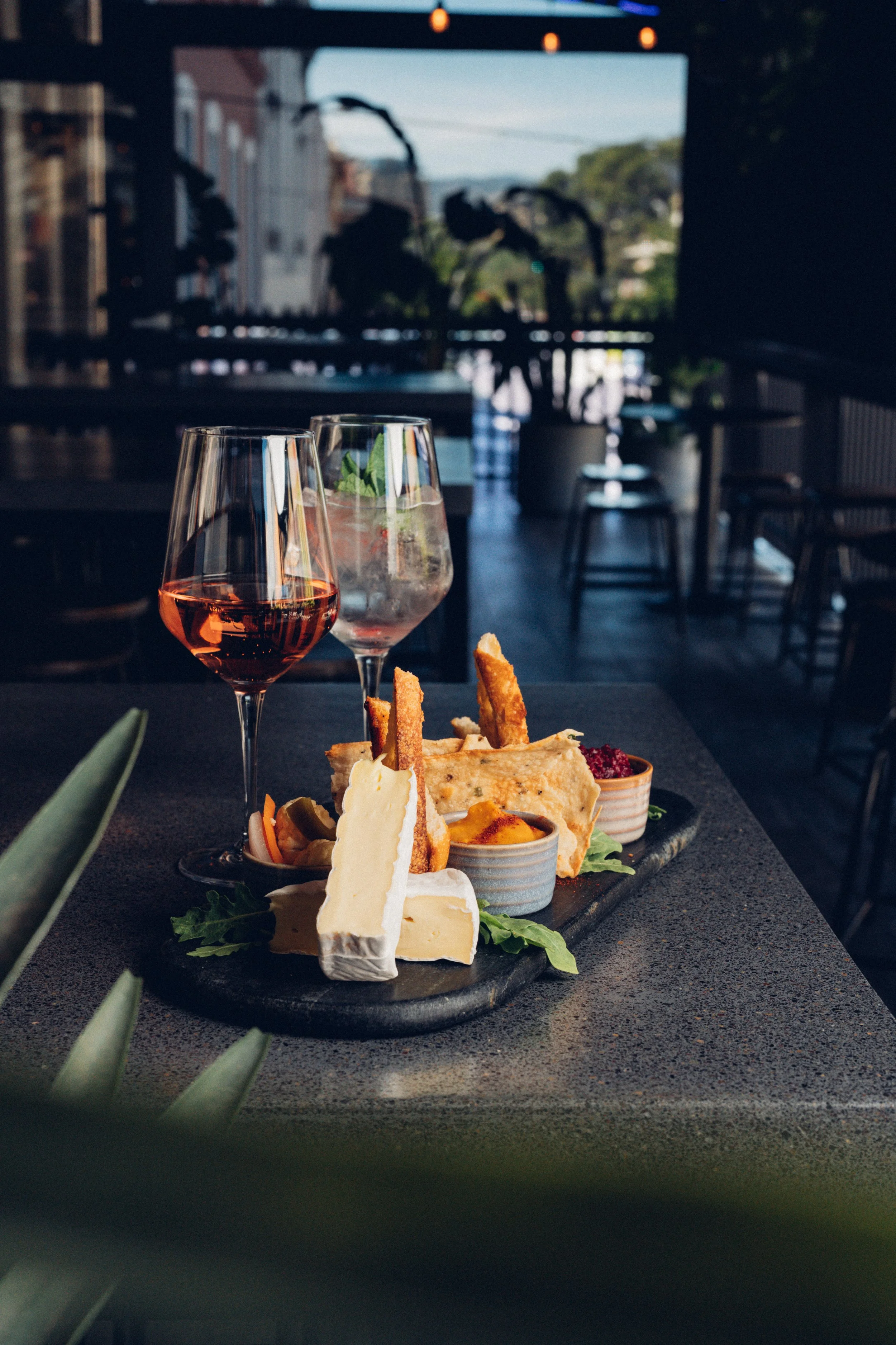
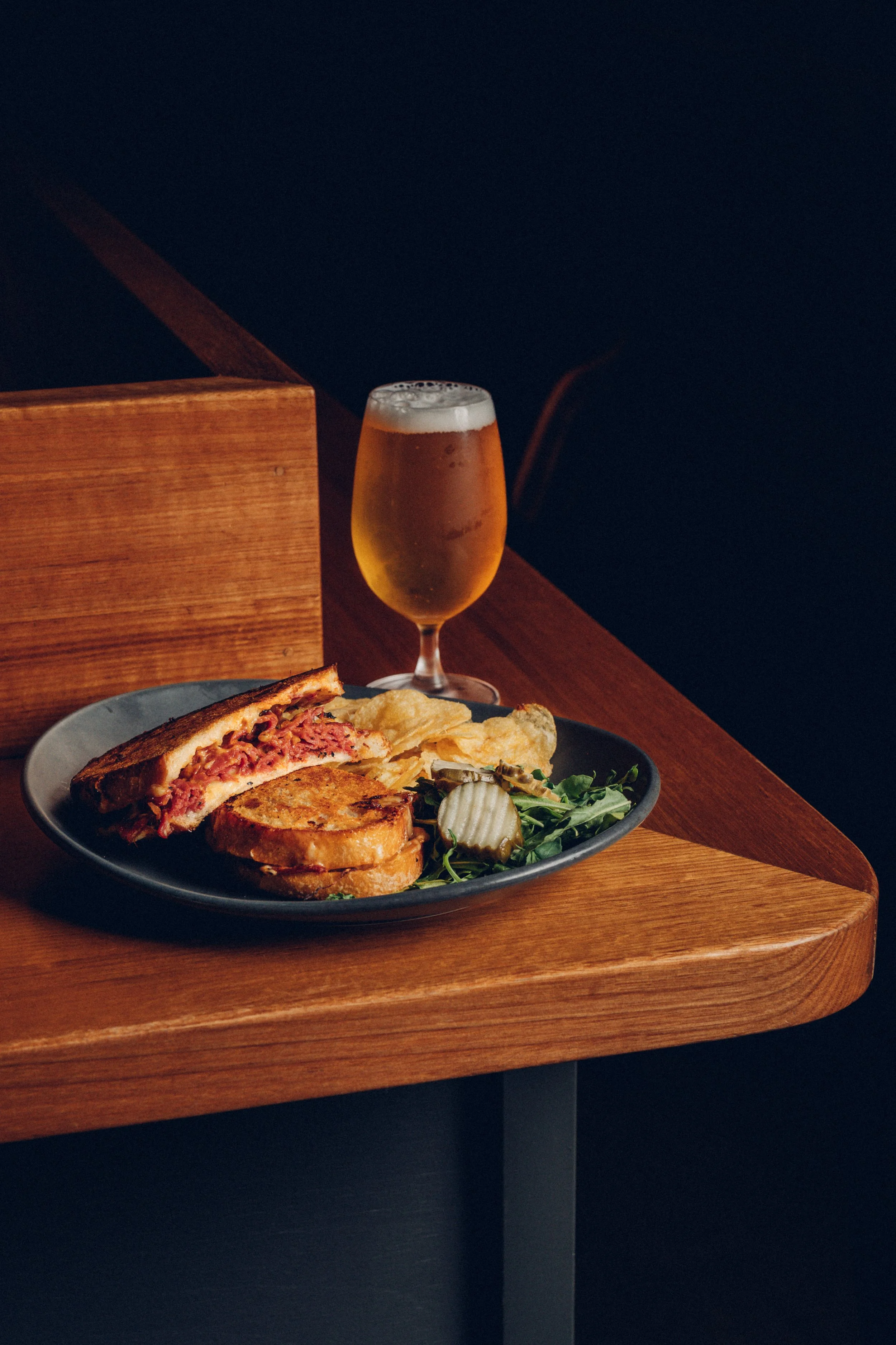
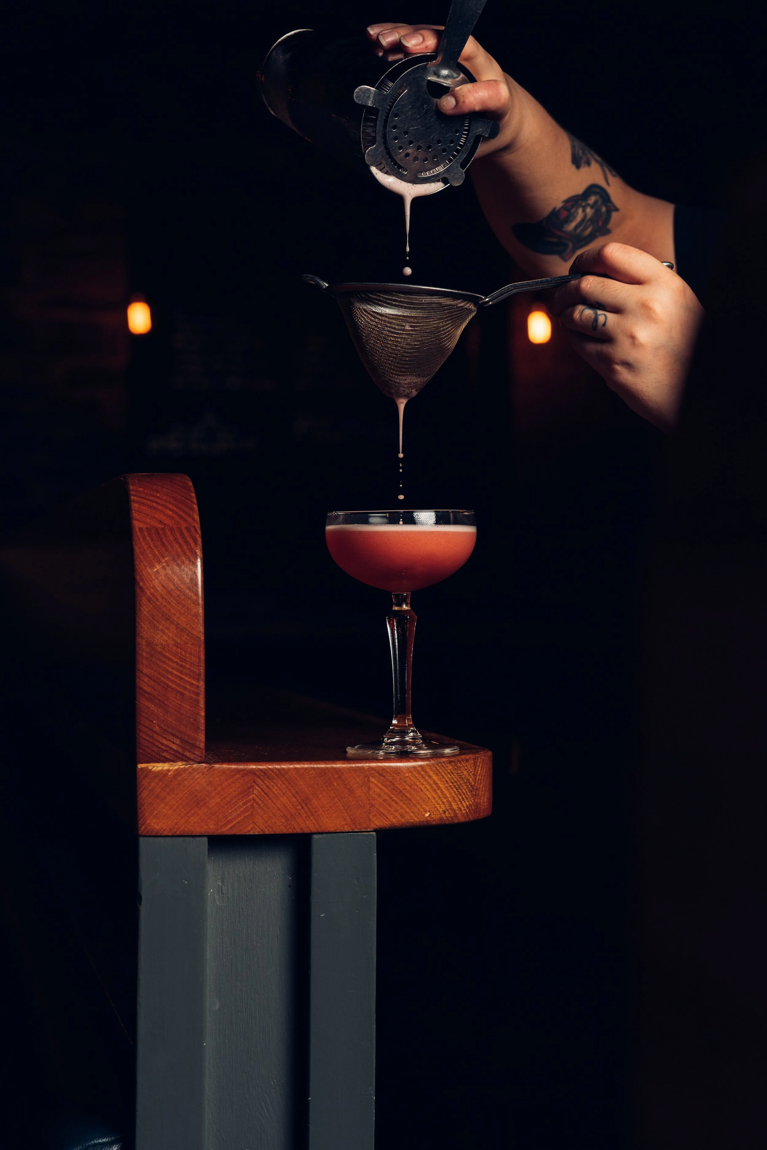
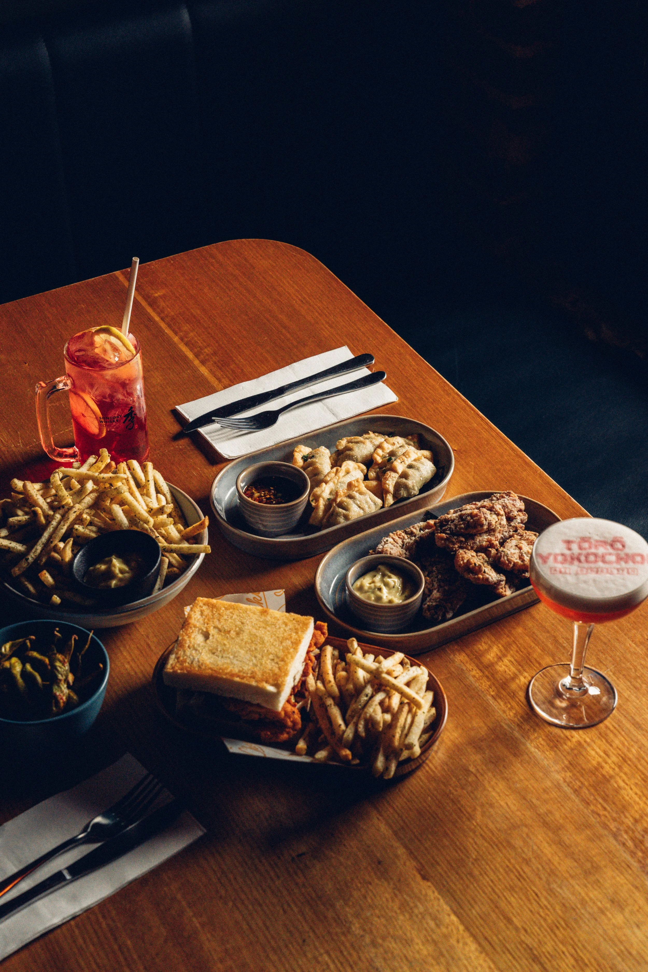
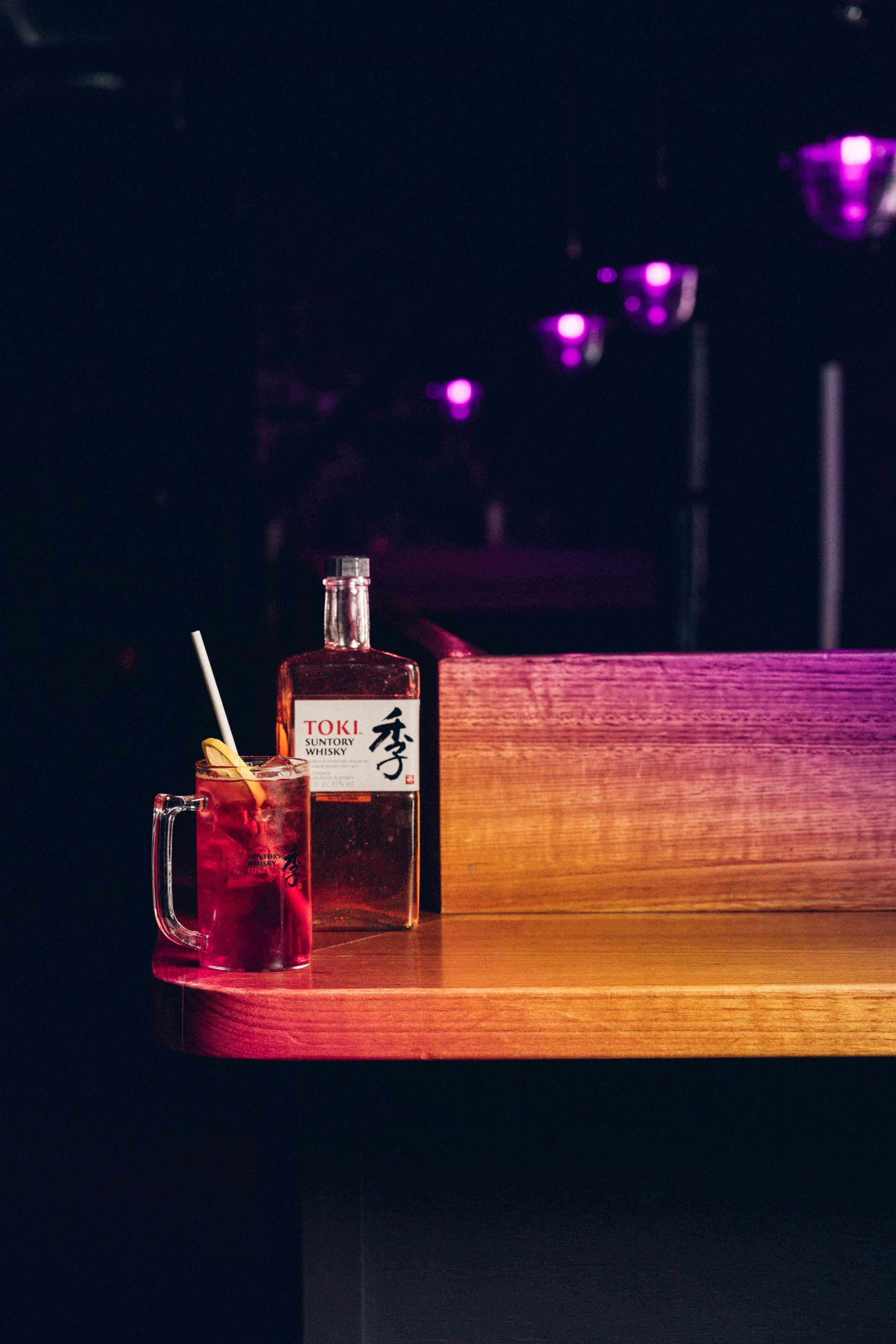
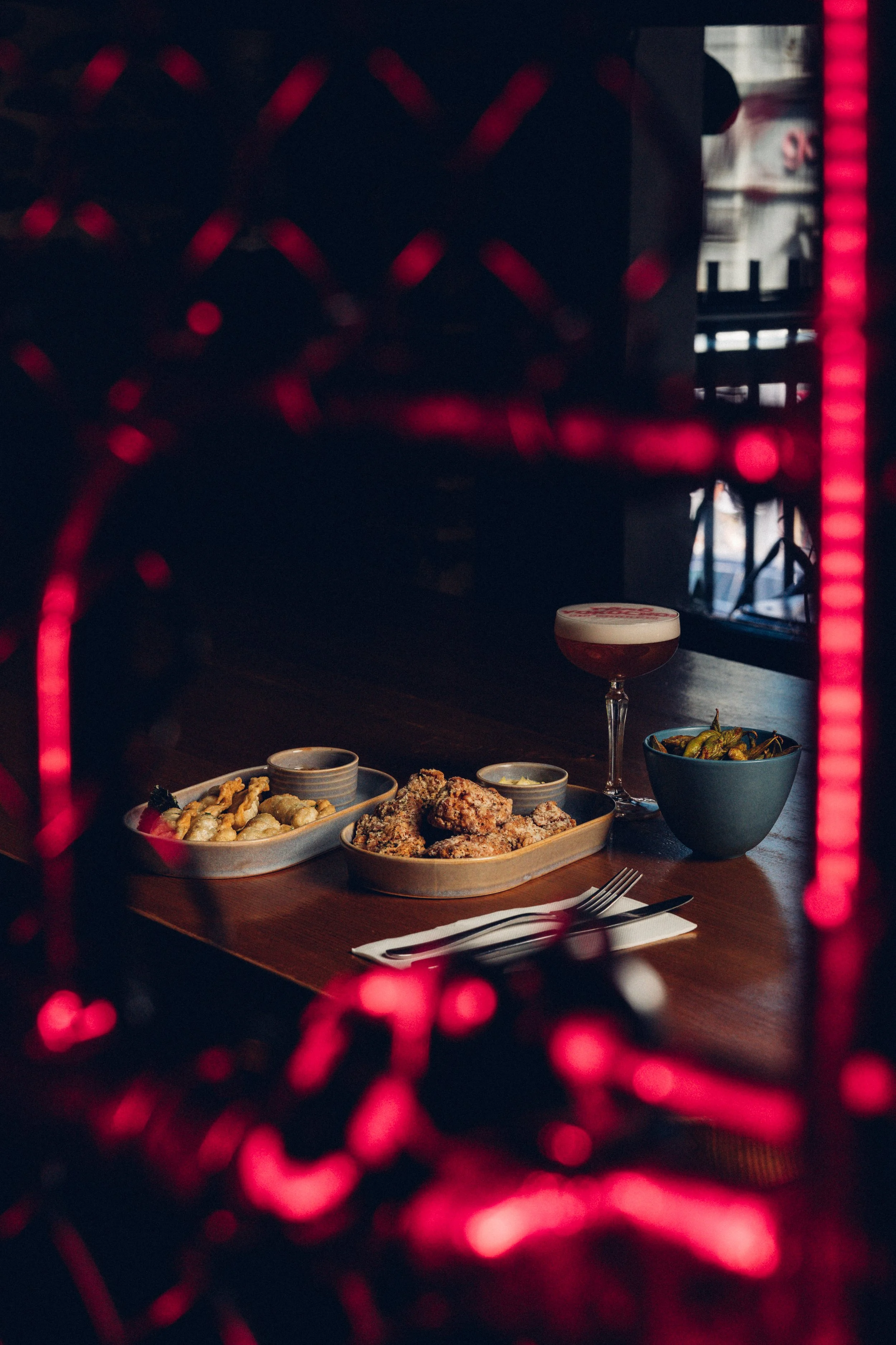
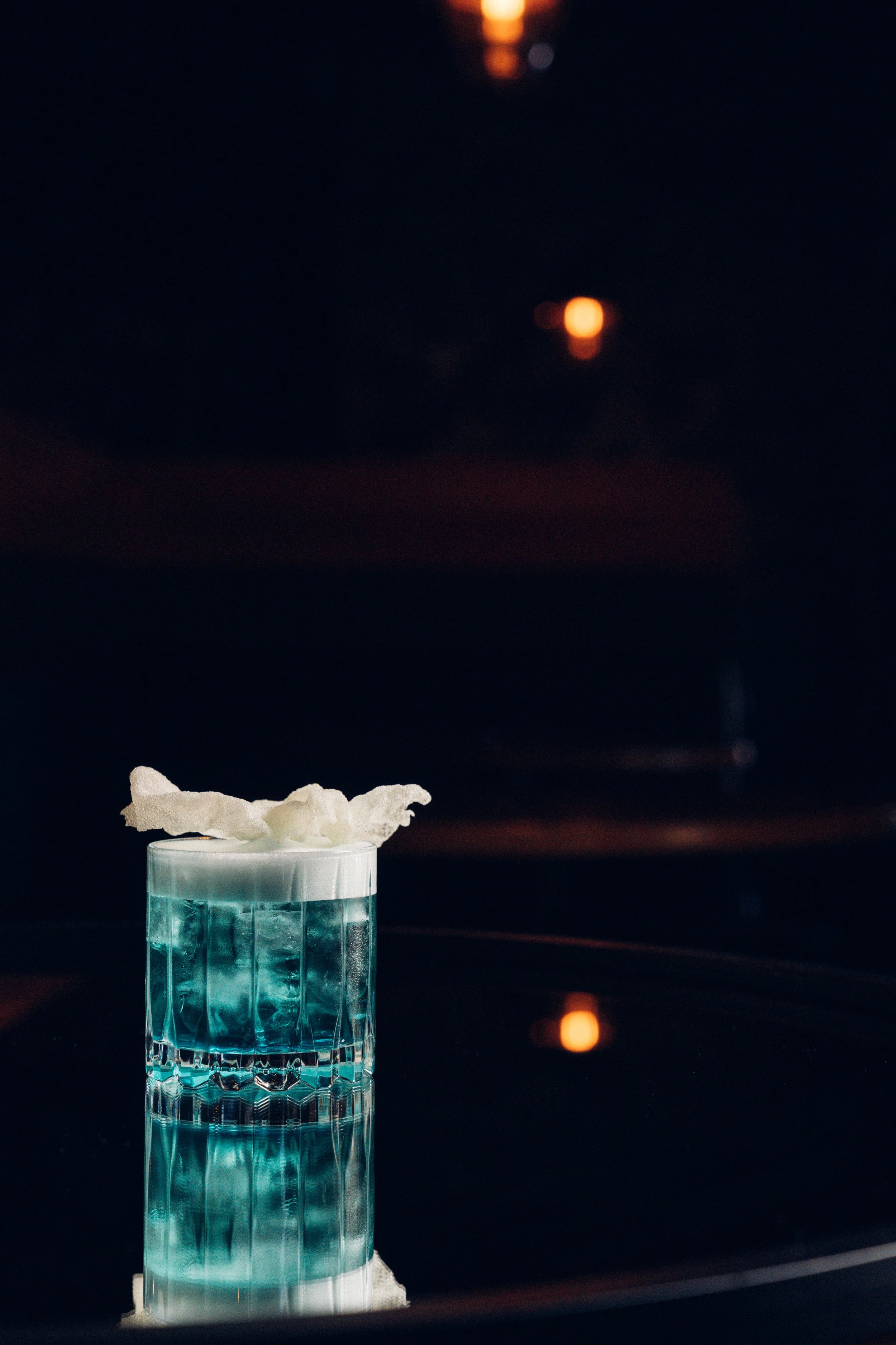
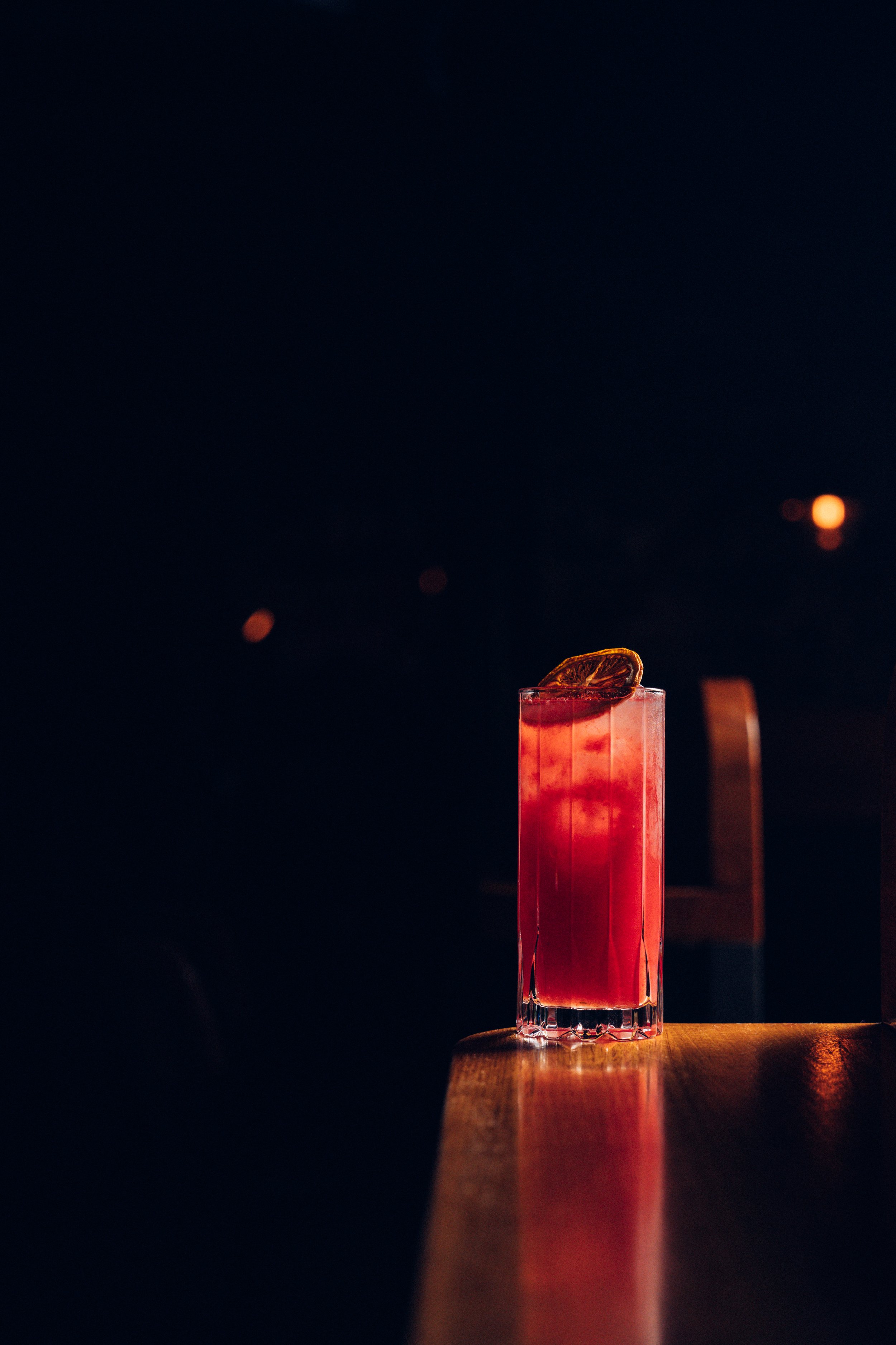
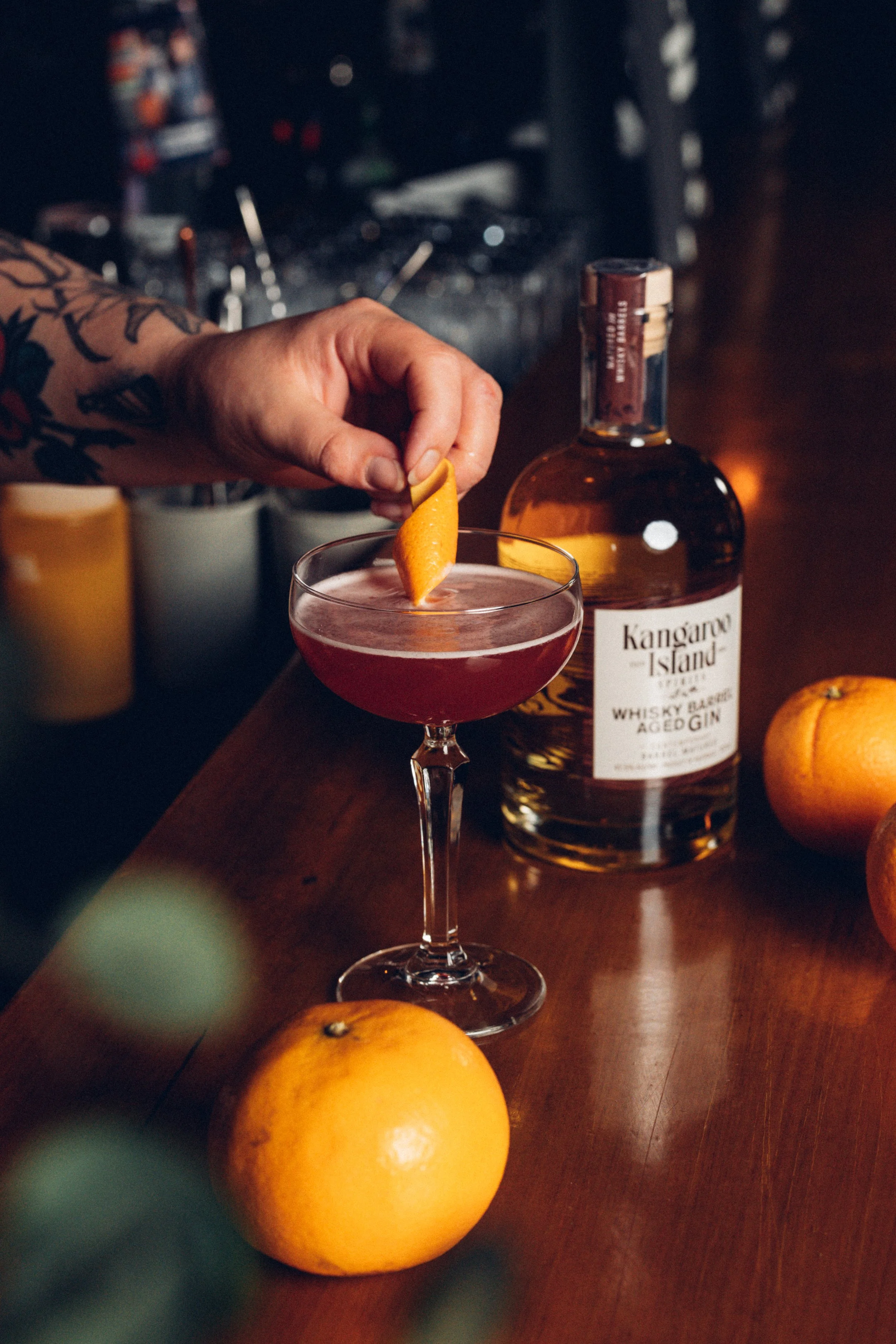
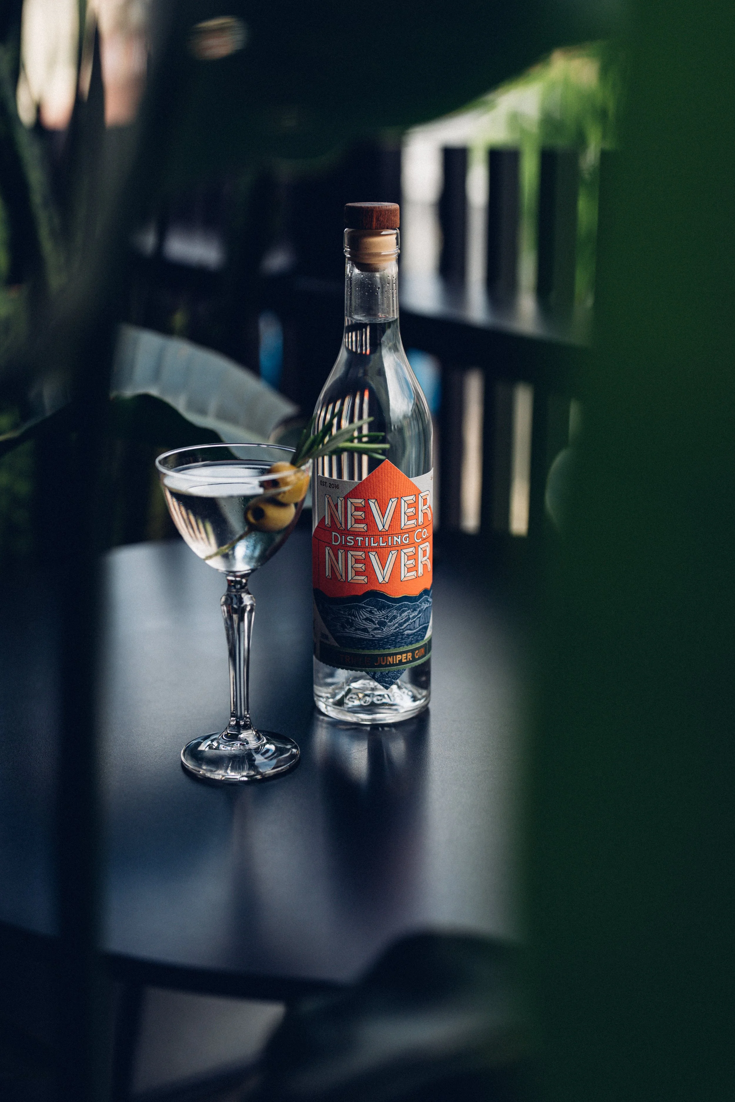
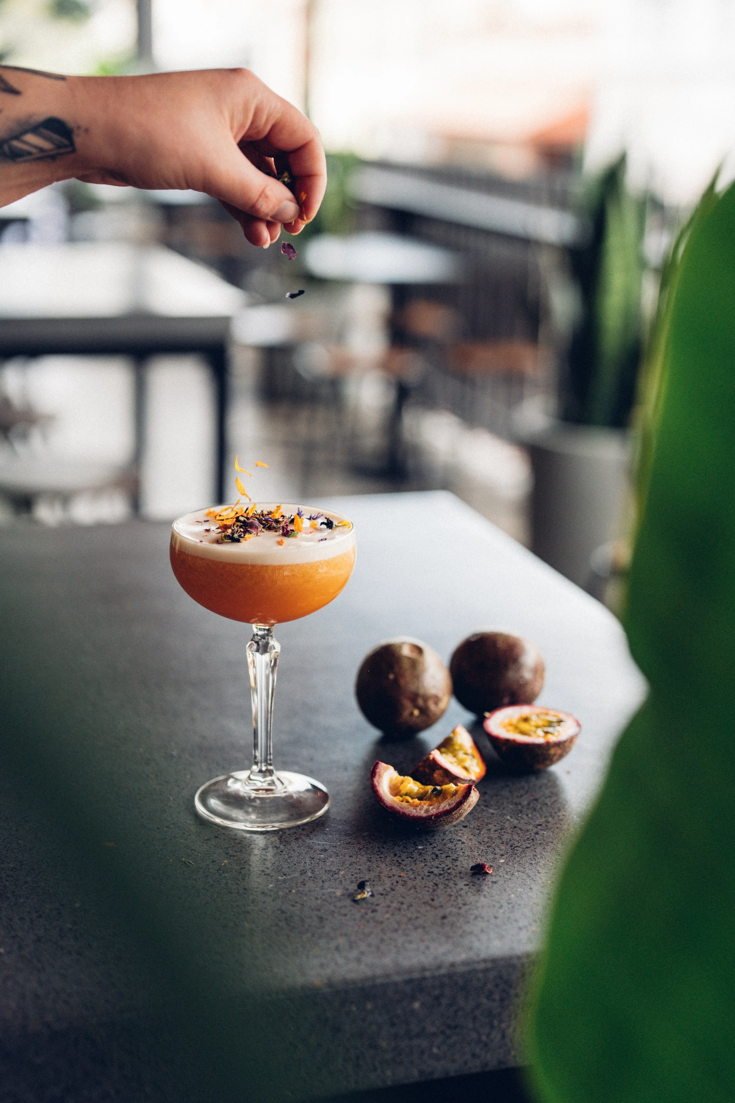
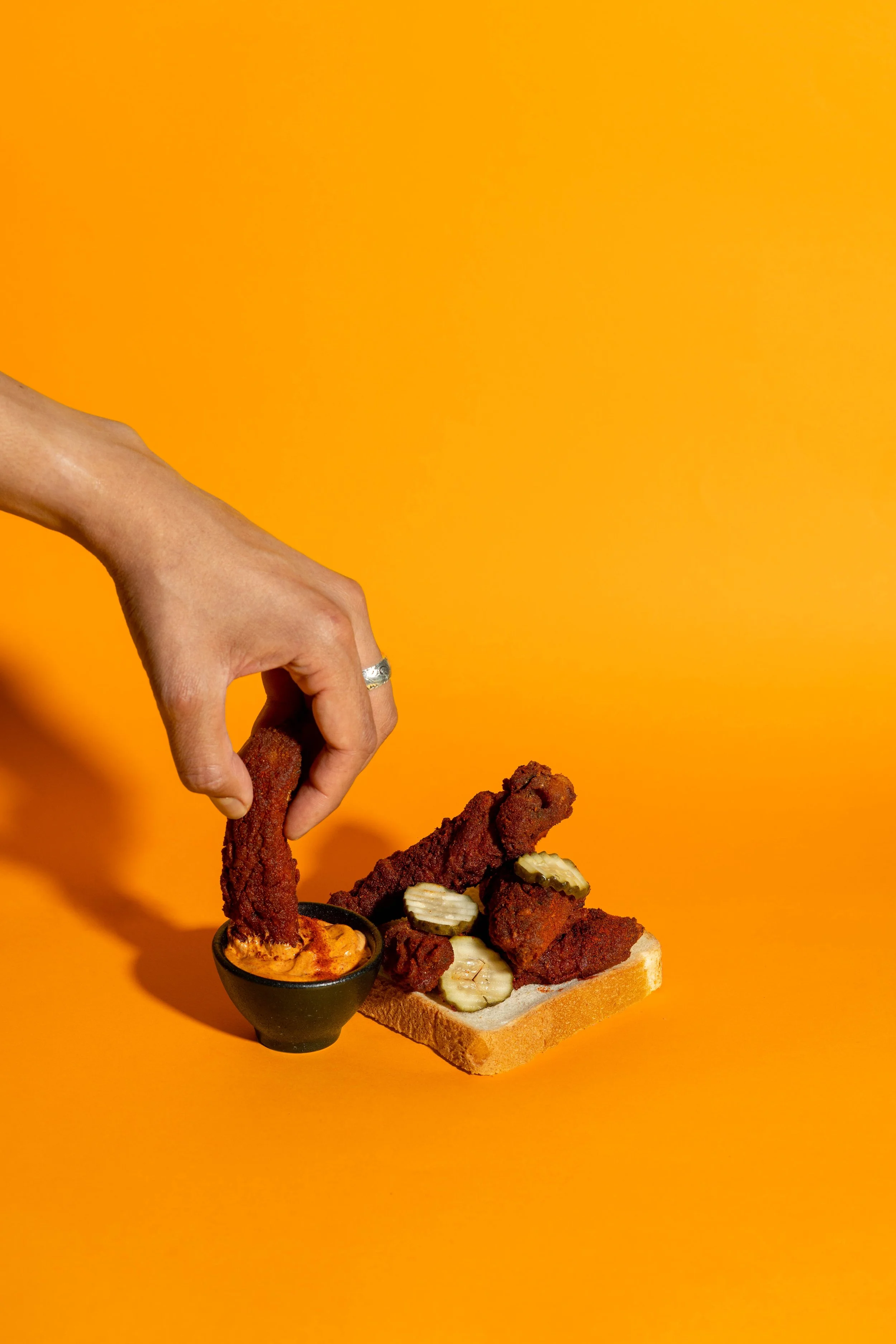
Build a consistent visual identity for BRKLYN's quarterly menus, cocktails, food, and Cheekies. One continuous body of work, not a series of disconnected posts.
What I did
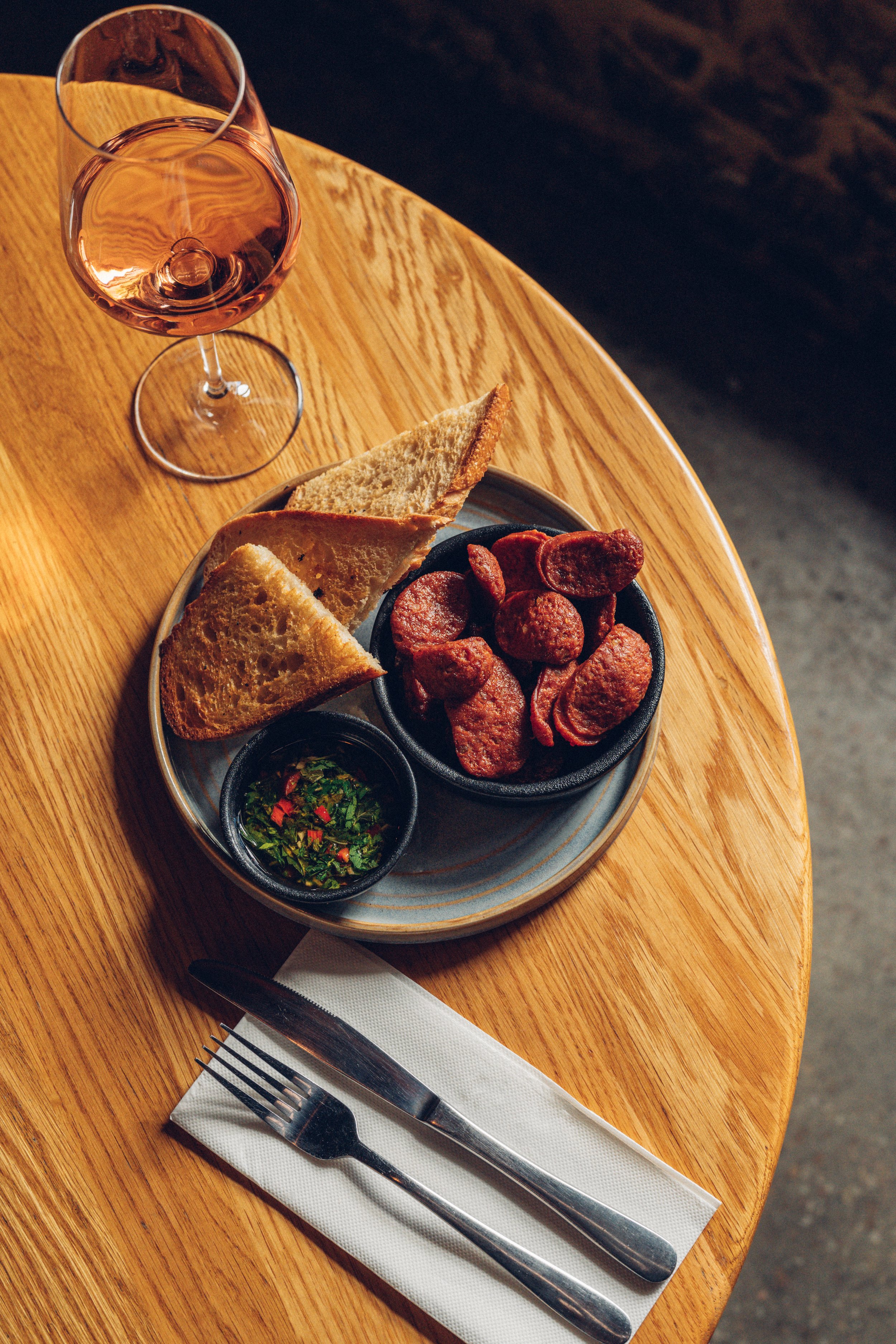
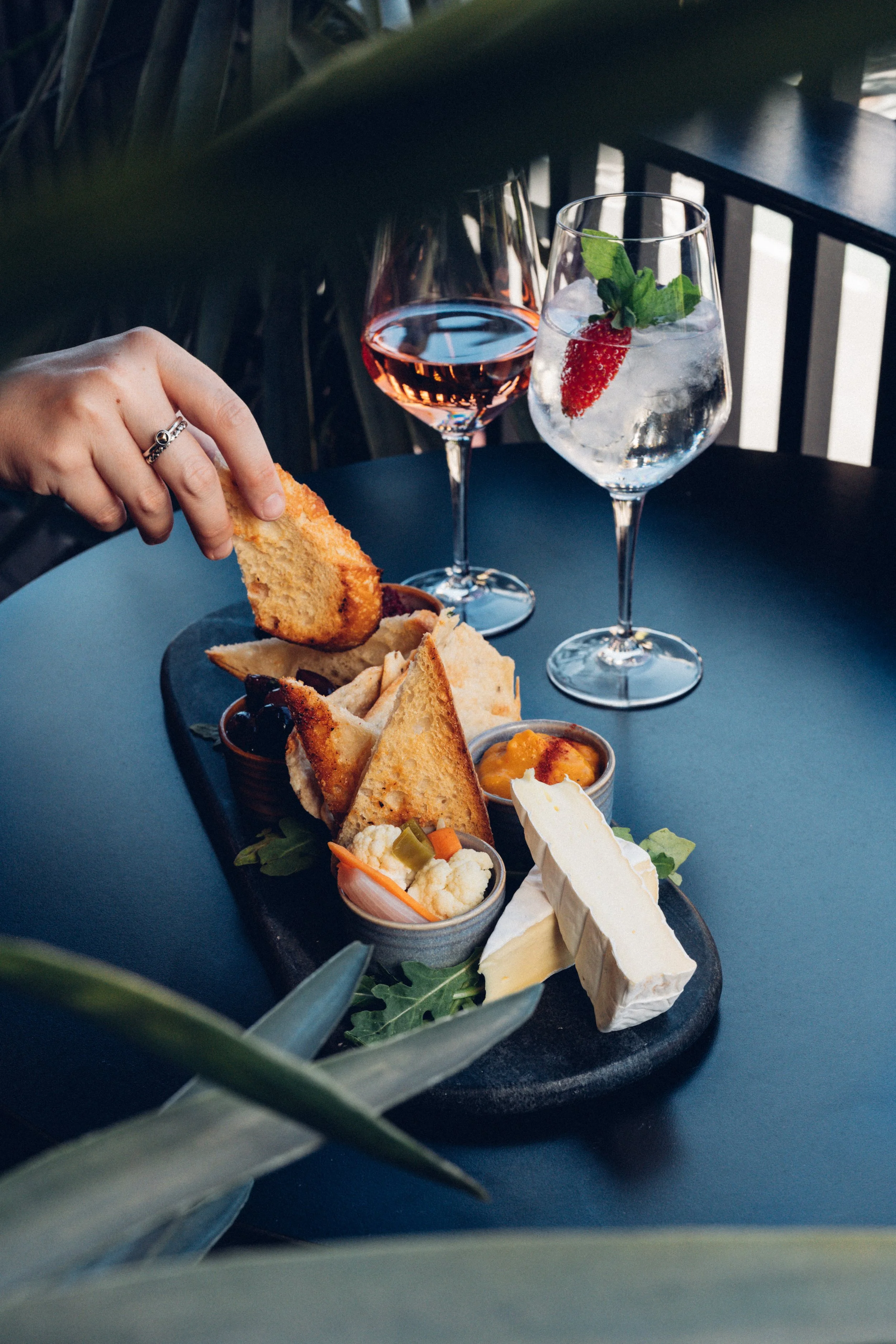
Seasonal photography
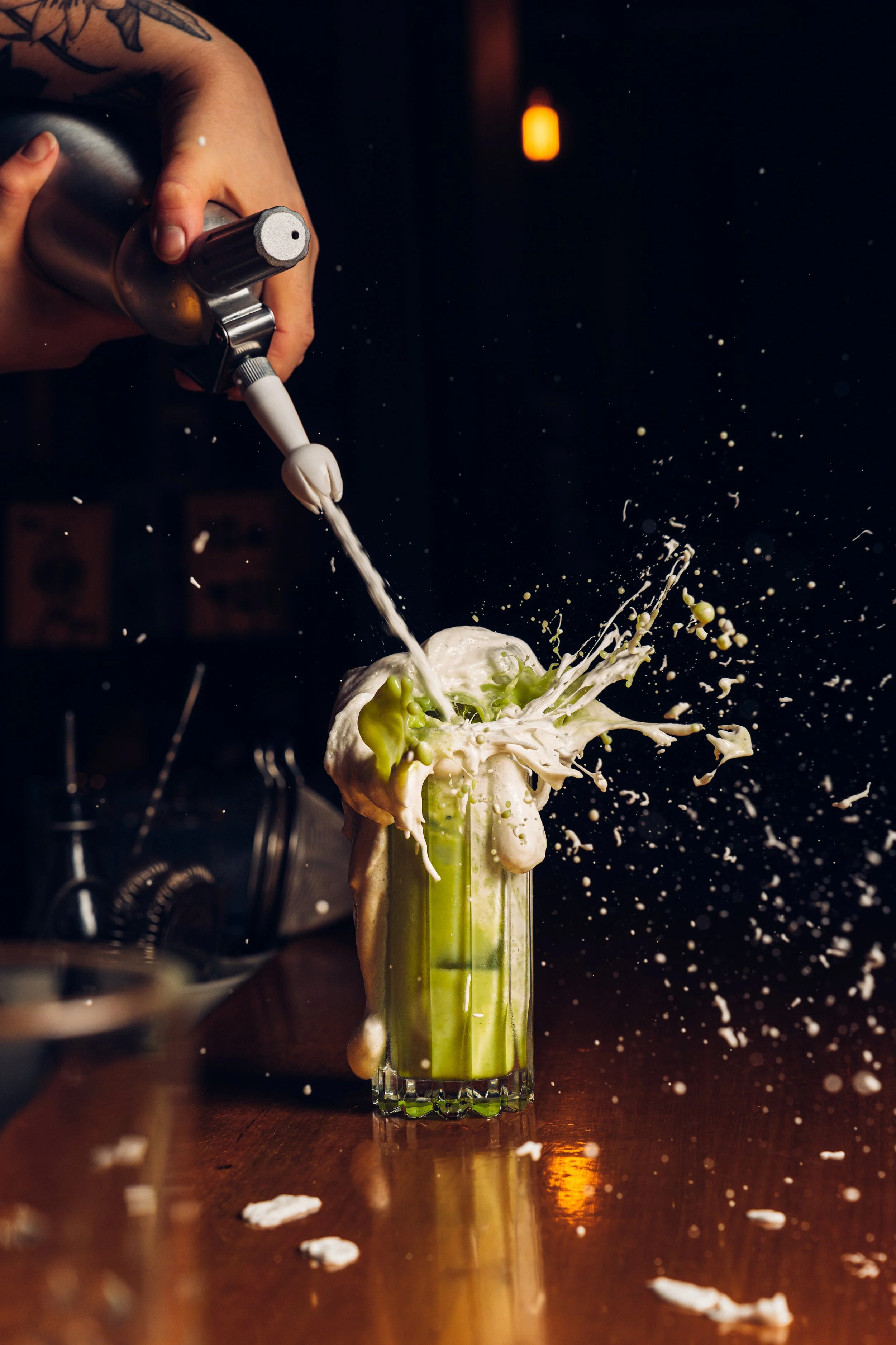
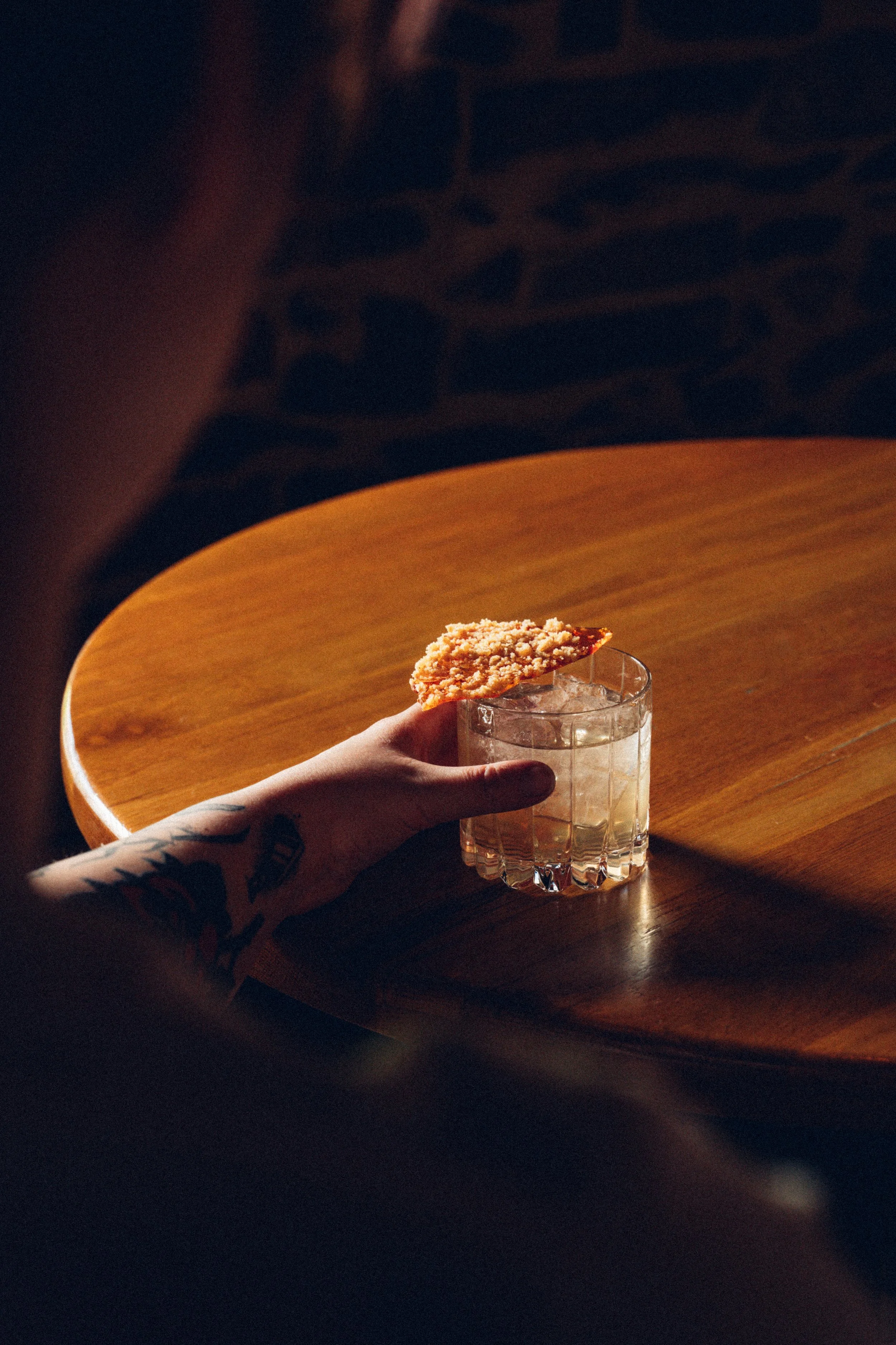
Cocktail and food styling
Short-form video content
Brand-styled grade across every shoot
Result
By mid-2024, a BRKLYN frame was identifiable from the scroll before anyone read the handle. Brand recognition built through repetition with intent. The look that came out of this work is the look that now runs through the rest of the hospitality side.